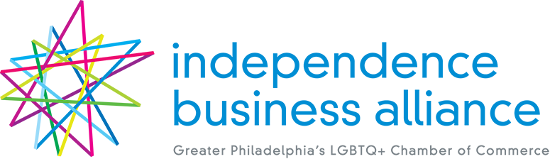
For the past several months, our Brand Refresh committee has been planning and developing a new look for the IBA. While our mission to enhance financial opportunities; foster diversity; develop leadership and collaboration; and advocate for positive change will remain unchanged, our new look will be a more vibrant one representing who the organization has become over the last 9 years and who we strive to be, moving forward.
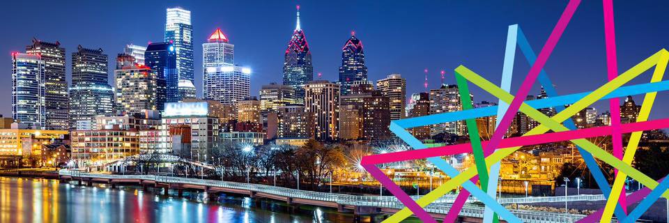
Our new logo is somewhat of an homage to our old one. We took the stars from the past and made them interconnected as a way to represent the IBA as a community that is connected by our commonalities and compelled to network for mutual benefit. We took the green and blue colors of the past and implemented brighter versions of them. We also added new colors, like shades of purples and reds. All the colors together represent our vibrant future , a youthful vibe, and a diverse outlook. We are a chamber on the move and we are open to anyone who shares our Mission.
![]()
The new shapes, colors and sizes show that our commitment to diversity and inclusion is truly at the forefront of everything we do. Our outreach after today begins with this logo and the excitement that comes with it. We’re proud to unveil it today, and we’re grateful that our membership, helped inspire it.
The committee who put this together was led by IBA Board Member and Marketing Committee Chair Mike Fanelle and Board Member Emeritus David Jeffreys. Their years of experience in this space and hours upon hours of volunteer work for the IBA helped us put together a very competitive RFP process which helped us select a winner whose creative expertise bore this brilliant design that we’ve come to love. Their hard work and dedication were instrumental in the brand refresh.
The designers of the logo – and all of the many changes that come with it from business cards to social media to our website – were Roni Lagin & Company with designers Roni Lagin and Georgena Senior. They listened to us and instinctively knew the direction we wanted to go. The winning logo was among the ones they presented on the very first round of entries. They’ve been patient, thoughtful, and tremendously creative, and we thank them for ushering the IBA into our next chapter.
Again, this new look won’t change was the IBA has always done. We are still committed to providing opportunities, access and resources to LGBT professionals and visible allies in the Greater Philadelphia area. But now we’ll be doing it with a little bit more style and with a more inclusive, vital look facing forward. After today, we will communicate that, like the Greater Philadelphia area we represent, we are truly OPEN for business.